There’s not many car reveals these days that the world actually stops for. A new Corvette. The next Miata. Defender? Well we waited long enough, god knows how long it’ll be before there’s another. Porsche shows a different 911 version each week. But of course there is one more that’s worth waiting up for. A new Mustang.
 When the Camaro and the Challenger took a break, the Mustang remained available as an all things to all people slice of American performance and style. It’s seen some ups and downs, but remaining in production since 1964 is a pretty decent achievement. Clearly there’s a lot of merit in Iacocca’s idea of a stylish, accessible, decent performing car for the everyman. And now there’s a new one.

We’d heard rumors of hybrid systems and 4WD to make this latest horse a bit more 2024, but the reality is Ford have played it extremely safe. And when I say safe, I also mean cheap. Despite what the PR wonks say, this S650 Mustang is a reheat of some S550 leftovers.

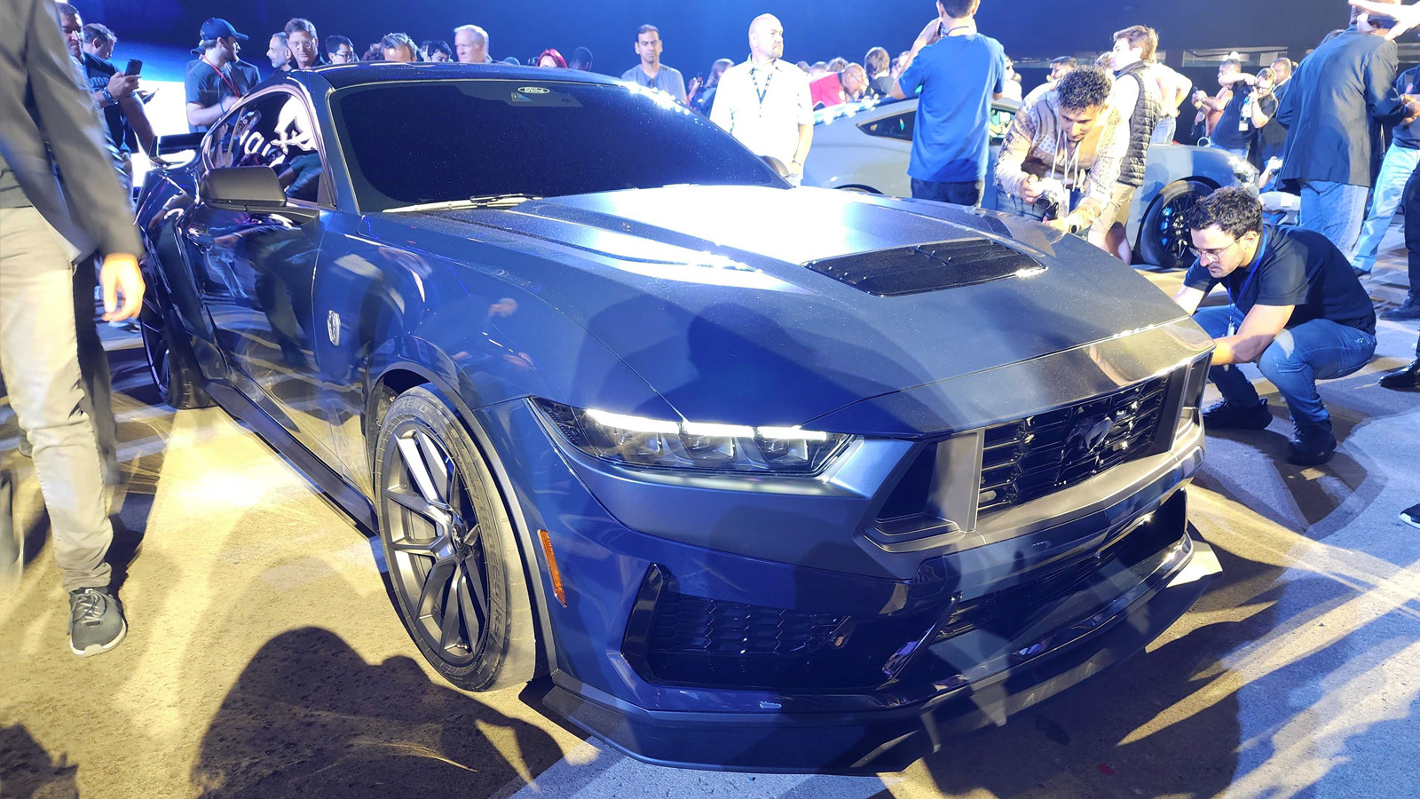
Much of the problem with the S550 Mustang was that it had turned into a bit of a pastiche. It was always a slightly awkward, gawky looking thing, endowed with too much hood and deck and not really enough passenger cabin. The overhangs were a bit too long, the roofline a bit too tight. Listen to some uniformed commentators and they’ll tell you that’s what makes muscle car proportions, too much is great and even more is better. Well that’s why they’re uninformed and I do this for a living. It’s all about nuance and balance in the volumes and proportions. The thing with this new Mustang is it uses the existing car’s body in white, so these proportions haven’t changed.


If you look at the side view, you can see the cant rail and the pillars haven’t altered at all. The shut lines for the doors are in exactly the same place. The daylight opening has changed slightly for the rear glass, but fundamentally you can see it’s the same car.

Looking at the front, the top horizontal line of the headlights now becomes the shut line of the hood and the top of the grill. This gives the whole down the road graphic a monobrow visage, and draws your attention to the shape of the hood and the fact there is a lot of sheet metal bending down to meet the lights. Like a Mk8 Golf, it looks like the front of the car is melting off. Not only that, but in replicating the three segment taillights in the main beams, it’s all starting to look bitty and unconsidered.
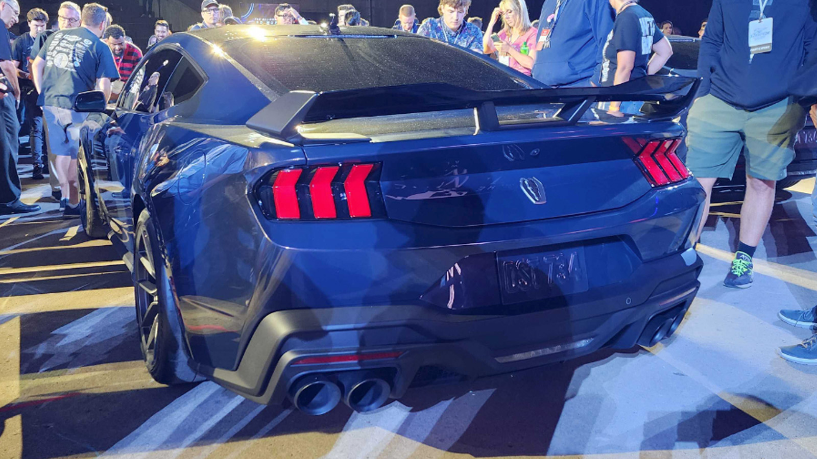
And those tail lights are doing some serious retro heavy lifting.

The three vertical bar tail light was present on the original ’64 and has remained in various forms ever since. The previous S550, despite having a slightly fat bum had a nice simple black infill panel with plenty of blank space in the center for various badging options. It worked well as a graphical call back to earlier cars and helped reduce the visual mass of all that bodywork. This new Mustang eschews that cleanliness for a more aggressive treatment that lowers the trunk opening but looks blander due to there being more body colored sheet metal. You have to be really careful doing this because if you get it wrong it can look cheap.

Speaking of looking cheap the interior is a major let down. I’m sure the new digital displays are crisp and have some nice animations, but the integration here is awful. There’s starting to be a lot of pushback around moving secondary controls to touchscreens in cars, so it’s surprising to see a car that supposedly plays on emotional appeal and driver engagement just plonk a couple of screens on top of the IP and call it a day.
So we’ve got a car that is basically the old car in a new cocktail dress. The underlying ungainliness of the old model hasn’t really changed, and has arguably been exacerbated. There’s no reinvention here, no four wheel drive for inclement states and no hybrid for the inner city. It’s all a bit half assed, which to a degree I understand. Like all OEMs Ford is betting big on EVs throwing all their spare dollar bills in that direction, so there’s not a lot left over for the ICE stuff. You can only work with what you’re given. But this is the last the last ICE Mustang we’re going to get and it’s basically the same as the last one but uglier?

You have a car with nearly sixty years of design heritage, that adapted to reflect the circumstances of it’s time, but Ford is determined to keep us in 1964. After the first Mustang, we had the baroque malaise Mustang II. Ok, not great, but it sold (a lot!), was the right car for the right time and kept the name alive.

As we moved into the microprocessor eighties a new Mustang appeared with weirdo metric tires, aero styling and a hatchback. Pretty advanced stuff. But as we headed towards the millennium, the Mustang took a step back into the warm bath of nostalgia. Since then it’s been, like it’s contemporaries the Camaro and Challenger trading on a heritage appeal that does a disservice to those earlier generations.
If the Mustang’s appeal is it’s authenticity, why are we getting a fuzzy copy of a copy, like a bootleg cassette that’s been passed around high school and re-recorded repeatedly? Surely a really up to date Mustang would look around at today’s environmental challenges, the geopolitical landscape and what’s influencing popular culture and wonder how it would evolve.
An aero Mustang with a 4 cylinder turbo and a hatchback perhaps….


“Like a Mk8 Golf, it looks like the front of the car is melting off.”
Agreed x10000. That thing looks like a dumpy caveman with a forehead and unibrow. I can’t stand it and I don’t think I’ll ever come around to liking it. It’s the same with this mustang.
I think the Mk6 was the last truly pretty Golf. The Mk7 brought some nice geometry into the design, but I had the same droopy front end due to safety regs.
But that was before I saw the Mk8. Makes the Mk7 look amazing by comparison. Ugh.
Am I the only one who thinks this looks a LOT like a Camaro?
I’ve seen this comment made a few times, while I don’t think it’s necessarily true in the literal visual sense, I do think they share similar ideas in that they’ve evolved a particular design over and over so many times they’re basically scrunched up caricatures at this point.
It is always best to reserve your design opinion until you have seen the car in-person and done a walk around. That said, the exterior styling looks as descent as you’d expect from an OEM these days, and this might actually be a little on the better side of average.
Where it really falls apart is the interior. Dude!! This interior is not a sports car interior but a wannabe posh tech fest. Why are all the buttons on a touch screen? Sports cars are instruments of speed, tuned for efficiency, an extension of the driver – not fancy gismotrons. Good lord, remember not to run with an idea because it is cool!
Touch screens are AWFUL in cars! You have to look at them to use them. No feedback, not muscle memory. Creates a barrier between car and driver. Cant wait for this fad to pass.
Yeah, I’m always cautious about doing pieces like this (and I’ve had a lot of requests!) because I’m always saying you really need to see and touch a car in person to understand it. But it’s not always possible so here we are.
I’m certainly not a professional car designer, but I’ve been a long time Mustang fan. My first car (as a high school student in the early 1970’s) was a rusty 1965 Mustang convertible (Ivy Green, 289). I’ve owned 5 Mustangs, including my current 2015 GT. When I was a kid I walked to a nearby Ford dealer and saw the festivities when the 1965 (1964 1/2) Mustang was introduced (it was a white coupe with a red interior). I went to the 1964 World’s Fair and sat in a Mustang convertible on the “Magic Skyway’ ride.
I’m beyond thrilled that Ford chose to keep the internal combustion engine for this refresh, especially the classic 5.0 V8. I’m also ecstatic that Ford kept the manual transmission. However, beyond that, I’m disappointed in the car, and think it’s a step back from the previous model in many ways.
While the body hard points and greenhouse are the same, I don’t like the front and rear end treatments. The front end is both more bland as well as incorporates the currently trendy but I think ugly ‘asteroid impact crater’ school of design look with big, gaping black spaces in the bumper (the Civic R is the worst offender). The taillights, while maybe ‘edgy’, are too Honda Civic-esque and not as classically Mustang as on the S550.
I like what seems to be offerings of more colors for interior upholstery, two-tones and contrasting stitching. But the two-iPad dash is unspeakably, gag-me horrible. It literally looks like two iPads hot-glued to the dash in some sort of striving for the absolutely cheapest build they could get away with. Is that really the best they could do? Apparently Jim Farley must have cut the design, engineering, and manufacturing budget for the interior to zero.
I also can’t deal with putting too many controls on a touch screen, which on its own is a deal-breaker for me. I will never buy a car with climate controls on a touch screen. I just don’t think it’s safe and don’t feel comfortable driving one. I’m not the only one who feels this way. I know Tesla and all their fan bois love it, but it’s just not as usable, easy, or safe as haptic knobs and buttons. The only reason Ford and other car manufacturers do it is because it’s cheaper.
https://arstechnica.com/cars/2022/0…y-are-worse-than-buttons-in-cars-study-finds/
https://www.nytimes.com/2022/05/23/opinion/touch-screens-cars.html
https://www.cnbc.com/2022/08/22/why-some-people-hate-touch-screens-in-cars.html
I’m sure Ford doesn’t care about my opinions (though I may be the prime Mustang demographic), and all this is baked in, but I’ll definitely be keeping my 2015.
Ford management to design team: “Give us a fuzzy copy of a copy!”
Mission accomplished.
To show you how much Ford failed, look at how well Nissan did with the nice new Z design on the old platform. Nissan also outclassed Ford with the Z interior, too. The new Mustang interior is a huge fail. Along with the VW GTI, this is another car I won’t even consider because of the horrible interior.
Big waste to put a nice V8 into such a poorly designed product.
Yes, the Z isn’t perfect (the front grill opening is problematic for me, being very rigid and square and not really firing the shape of the hood), but overall it’s pretty successful and shows what you can do on an existing car.
I’m surprised by the amount of negativity about the 2015+ mustang design. I always thought it was one of the nicer looking coupe designs to come out post 2000’s. I agree that the 2024 looks a bit awkward in certain shots, but the convertible looks awfully good, and I think it’s the extra tack-on elements on the higher GT trims that is questionable – really looking forward to seeing how these look in person.
There is one upside to me in the fact that this is clearly just a refresh, not a new model: like the Charger/Challenger/Durango long running models, quality should steadily improve over time on what amounts to a 10+ year model run.
It just hit me – I always told myself that I would buy a mustang if they put in an IRS, yet so far I have failed to pull the trigger. I’ll be catching the 302 at long last during what appears to be the final Mustang ICE generation.
I am actually glad to hear that this one seems to be flopping with so many Autopians – hopefully that will keep prices at least somewhat in check. “Base” model GT with a manual for me!
For anyone interested, Autopian friend Doug D has a good quirks n’ features review of it up now.
And yeah, it has a kinda charming Fox Body gauge cluster option.