I have important news for everyone not just interested in cars or automotive design, but everyone with eyes, period: we at Autopian Linguistic Labs and Day Spa have come up with a term to describe the industry-wide automotive design shift that was happening around the late 1980s to the early 1990s: aerosion. Yes, yes, you’re welcome. Let’s describe aerosion in a bit more detail, so you can begin to employ this new term immediately.
Most likely the easiest way to convey the concept of aerosion is with some images, so here’s a few notable examples of the trend:
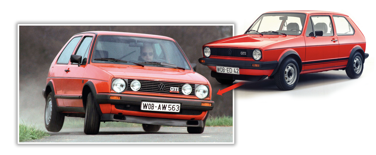
The shift from the Mk.1 to Mk.2 Golf is one of the clearest examples, as the fundamental vocabulary used in the design didn’t change, but the execution did. The basic proportions and details are all still essentially the same, but everything has been rounded and smoothed a bit, like a river stone,. worn smooth by decades of moving water. There’s also a slight inflation effect, as though the original angular car had been inflated like a beach ball.

The move from the Jeep XJ Cherokee to ZJ Grand Cherokee is another great example of this, and shows similar traits: smoothing, inflating, larger, rounder, and now featuring shaped plastic headlamps where previously sealed beams (in this case rectangular) resided.
[Editor’s Note: This isn’t particularly relevant here, but I’d like to point out that the transition to the ZJ also brought about a bizarre beltline “jog” when it hit the hood after it flowed smoothly from the rear along the bottoms of the windows. You’ll see that the XJ doesn’t have this jog; the hood is in line with the beltline — a design that looks better, I think. -DT]
This aerosion period is when most cars (at least in U.S. markets) made the transition from off-the-shelf sealed beam headlamps to custom-for-the-model plastic, shaped units.
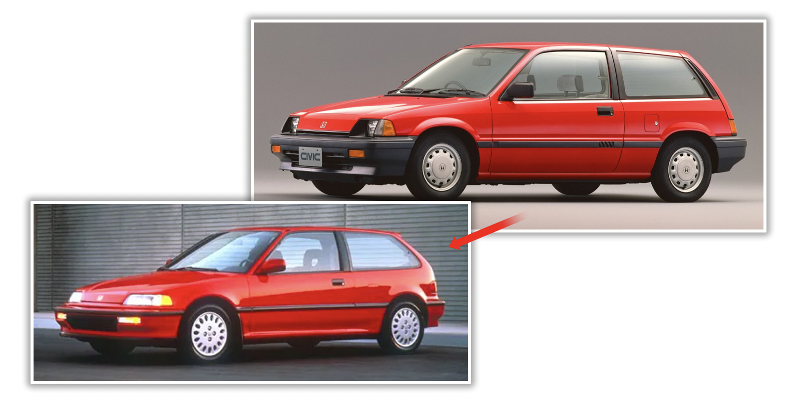
This phenomenon was global; Honda’s Civic went from its third/fourth generation and aeroded into the fifth, fully aerosion-compliant fifth generation, showing all the traits: shaped headlamps, rounded surfaces, plumping, and so on. A more sophisticated understanding of aerodynamics was the big factor here, and it’s remarkable to see how universally similar design changes happened all over the world.
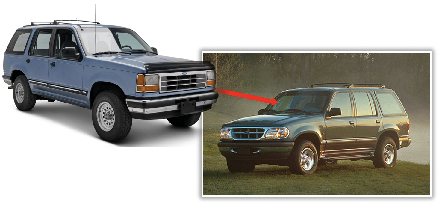
The Ford Explorer is another great example, with its first generation in 1991 being an interesting partially-aeroded design, with custom headlamps that are still mostly rectangular and some smoothed corners, but it took until the second-gen in 1995 for the SUV to become fully aerosion-compliant, with much more rounding, plumping, and dramatically-shaped lighting.
Also note the transition into bumpers becoming much more integrated into the body, in shape and overall design.
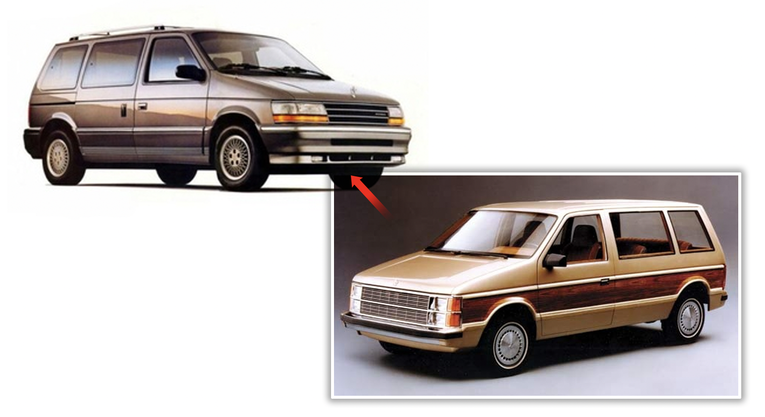
Minivans, of course, weren’t aerosion-averse either, as the original 1984 Dodge Caravan design was completely aeroded by the 1991 shift to the second generation. Sealed beams were gone, there was body inflation, edges sanded into smoothness, bumpers integrated even more with body-colored covers.
The Aerosion Shift was an important one for automotive design, because not only did it set the look for almost every ’90s to early 2000s car, it established so many of the essential traits of modern automotive design, with its significant focus on aerodynamics, fully integrated bumpers, wild freedom in light shapes, and a general unity of form that hadn’t ever really been accomplished for mass-market cars before.
Cars since aerosion have become one smooth primary form, as opposed to a main form with a lot of things (bumpers, lights, trim) stuck on.
Aerosion is a big deal in automotive design, and I’m thankful that it finally has a name.




In the 1970s and 1980s, cars became more rounded due to their improved aerodynamics and fuel efficiency. Manufacturers knew that round shapes had less resistance to wind, so they created them to decrease drag, increase gas mileage, and enhance performance. Plus, customers reacted positively to these designs as they were more visually attractive and allowed cars to stand out in a crowded market. This trend was widely seen in many beloved models at the time and still impacts car design today.
https://cashcashcars.com/areas-served/junk-car-removals-los-angeles-ca/
You can really see this in the Gen 3 to 4, and 4-5 Celicas. I think the 4th gen still looked good, but then it went fully melted by Gen 5.
[url=https://postimg.cc/vgJvrpzK][img]https://i.postimg.cc/cCH5SW8d/Celicas-aerofication.jpg[/img][/url]
Can we not post pics?
https://i.postimg.cc/cCH5SW8d/Celicas-aerofication.jpg
I would also throw in the C3 to C4 Corvette into this mix, although I have dubbed it Soapification. From Webster’s Underground Dictionary and Chilidog Recipe Compendium:
Soapification: (Noun): When you used a shaped soap to the point that all the lines and character have been removed. See Also: Bondo Bubble Bath.
I did aerodynamics, though mostly with water. I have to argue that point.
There seem to be minor advantages, but the bigger driver was the advent of 3D CAD, allowing more complex designs and the creation of tooling to make these body designs. The rounded shapes were a way to visually differentiate, no different from hemlines changing in skirts. Older cars couldn’t be designed and made this way, but new cars could be. Therefore, they would be.
“…1984 Dodge Caravan design was completely aeroded by the 1991 shift to the second generation. Sealed beams were gone, there was body inflation, edges sanded into smoothness, bumpers integrated even more with body-colored covers…”
Um, I hate to point it out that Dodge still had the sealed beam headlamps on its second generation Caravan:
https://media.ed.edmunds-media.com/dodge/caravan/1991/oem/1991_dodge_caravan_cargo-minivan_base_fq_oem_1_500.jpg
If this one was probably a concept vehicle or a stillborn design, here’s the part list and diagram (look at the bottom diagram) that proves otherwise:
https://www.curbsideclassic.com/wp-content/comment-image/394889.jpg
No idea where this one was ever sold or how long was this bizarre nose was offered on the second generation Caravan.
Beanification or Jellybeanification?
I think the best example of this would be the Ford F-Series. Take a look at the 96 F150 vs the 97 F150. That’s about as Aerosiony as I can think of. Maybe RAM?
I think a lot of this design theme had as much to do with sleeker designs of the era as it did with the ability to mass produce vehicles with these shapes. A lot of vehicle production design falls back on what can be produced in mass.
Ha! Good one
I have to confess i liked the nineties style.The eighties were interesting but ultimately too crude.The nineties smoothed the awkward corners making most cars look far better.
But dont most of them look dull now ????
I think you’re neglecting one of the major contributors to this change – improvements to computing (both mainframe and personal computers) and the rise of Computer Aided Design. While many of the basic tenants of creating an aerodynamic vehicle shape were understood, CAD allowed the effects of very specific features to be investigated – flush windows, door handles, smoothed lines and transitions (especially from the roofline to the rear glass to the trunk lid on a sedan), and reduced grill opening sizes were all trends that really could be traced back to CAD. Plus, the improved ability of computers of the 80s and early 90s to handle complex curves and surfaces allowed these to be incorporated into designs more quickly & easily with the effects better understood, compared without making clay bucks for all of them, and then these communicated to management.
I love this and will use it from now on. Much less … unsavory? than the term I was reduced to earlier in the week; “suppository smooth”.
A similar thing happened to the Starship Enterprise. The “Next Generation” version was way more curvy and liquid-looking than the original one.
And since I turned 7 in 1990, I was just the right age to be 100% on board with this trend when it happened. I still remember how hopelessly dowdy and boring all the old boxy ’80s cars looked to me as soon as the blobby ’90s ones appeared. My mom traded in her Tercel wagon for a Previa, and bam! We were living in the future!!!
(And speaking of Star Trek, I could not help but notice how much the interior of the Previa reminded me of the bridge of Picard’s ship — especially since ours was tan inside. Actually, there’s probably a lot of great commonalities between trends in Hollywood sci-fi set design and automotive design.)