Finally. FINALLY I have the answer. For years I’ve been calling municipalities, bothering utility workers servicing stop lamps, and — more recently — yelling at people on crosswalks. “Why are these traffic lights vertical while the ones in Texas are horizontal?!” I implore in a deranged tone pointing up at the lights with a trembling index finger, my eyes unfocused and bloodshot. “I need to know this! Please!” And for years, all I’ve received from these sources is hung-up phone calls and strange stares. But that ends today.
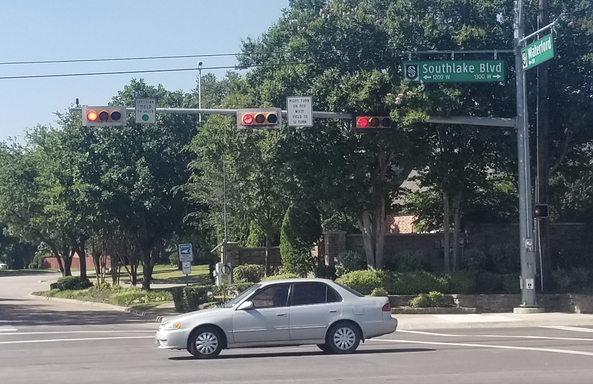
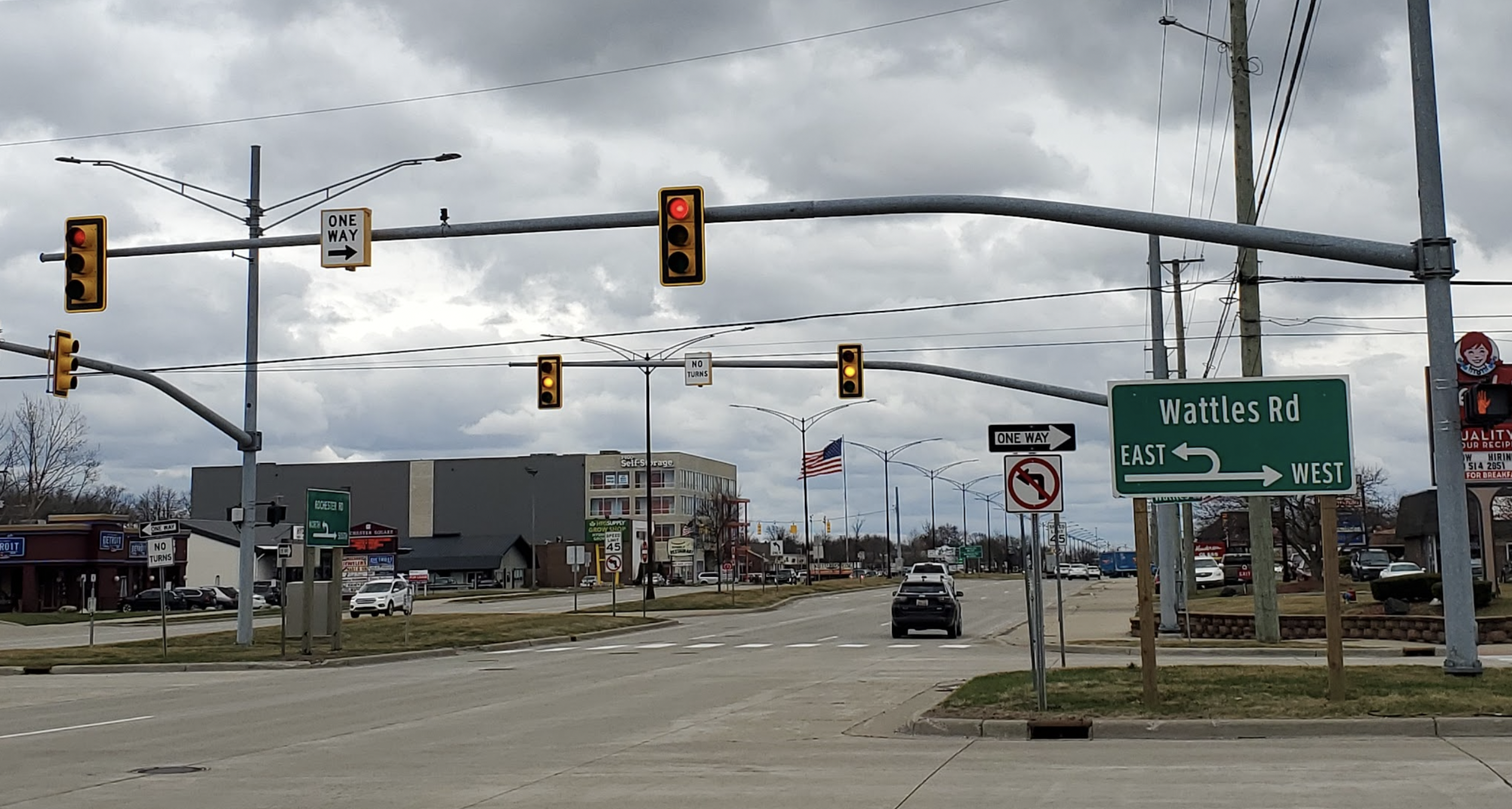
I’d reached out to various safety organizations over the years, I’d called DOTs from multiple states, and for the most part, people only had guesses as to why some traffic signals look like this:

While others look like this:

But recently, with the launch of The Autopian, a number of brilliant engineers have reached out to me offering to act as sources for stories. One civil engineer named Joe Eberle introduced himself in his email as a Transportation Engineer. Upon reading his note, my heart pounded; I felt like maybe, just maybe, I could get the definitive answer to the question that has haunted me for far too long. I decided to shoot my shot:
Joe’s initial response was short:
Yeah definitely! The short boring answer is it’s mostly whatever the state agency’s preference is. But I know you guys like the details so I’ll get some references and highlight some special use cases and send them this weekend. (Replacing the front suspension on my buddy’s truck tonight/tomorrow morning, so might not be until Sunday or Monday)
But then, presumably after some new struts and control arms had been installed into a truck, came the Big Kahuna; I was not prepared for the nerdiness that Mr. Eberle would impart upon me. Buckle up, folks. It’s about to get real.
Answers From A Transportation Enginerd
Wind, Some Notes About New ‘Backplates’ On Traffic Signals, Tethers

Now to the vertical vs. Horizontal signals. The standard arrangement for a traffic signal is to hang them vertically with red on top, green on bottom, but I think there are a few reasons for why a traffic signal would be mounted horizontally. First, mounting a signal horizontally allows two points of attachment to a span wire rather than only one at the top, which should secure the signal better and prevent them from swinging parallel to the road during high wind events. A recent safety improvement on new signals that you may have noticed is installing backplates with a reflective border that helps the signals stand out against the horizon during the day, and light them up with the reflective border at night.[…]While these safety benefits are great, they also largely increase the surface area of a signal with no significant weight gain, essentially acting as a sail and tossing the signals around with much lighter wind than before. This would be a good reason to mount them horizontally with two attachment points, however most DOT’s have started to require tethers on all span wire mounted signals to combat this. These tethers are basically just another wire running on the bottom of the signals to provide a second attachment point and anchor them in place. You may have also noticed many mast arms (heavy steel poles) at intersections with the signals mounted directly to them. These hard mounts would also eliminate any swaying caused by high winds, yet you still see horizontal signals mounted on them.
Vertical Clearance

Another reason signals could be mounted horizontally is to give better vertical clearance for the road below. Signals need to be an absolute minimum of 14′ above a roadway, ideally 17′-19′. But if for some reason the signals dipped too low, mounting them horizontally could potentially give an extra 2′-3′ of clearance. This seems like a pretty good reason, but typically if you have a long span that is sagging the signals too low, you just mount the span wire higher up on a pole or increase tension before you flip the signals around. If you were mounting traffic signals in a tunnel I suppose this would be a valid reason.
Aesthetics Matter

Lastly (and i think this is the real reason), people have preferences of how things look, even when it comes down to traffic signals. While horizontally mounted traffic signals may have originally been installed to combat swinging in the wind or for additional vertical clearance, modern signals have many other design elements to counter act these problems. Perhaps a city started mounting signals horizontally 50 years ago for a legitimate reason (like hurricane force winds), and then citizens became used to seeing all signals that way and wouldn’t want to see a vertical signal, so the city keeps tradition and all signals stay horizontal.[…]A great example of this that i’m currently involved in is painting signals black instead of yellow. Typically signals have always been yellow for the same reasons that school buses are yellow, to make them stand out. But several years ago a few county’s in Michigan started to install black traffic signals at all of their intersections. Now when we design new signals in the county there is almost always a fight between the local municipality and the county over whether the signals should be yellow or black for no reason other than it’s how someone prefers them to look.
I Reach Out To The Feds
Just as I sent my email to Eberle, I did a bit more digging to try once again to get to the bottom of the Horizontal versus Vertical traffic signal issue. I found myself reading a research paper about traffic lights, and saw at the top that it had been penned as part of a program called “Intersection Safety.” It turns out, the Federal Highway Administration (which falls under the Department of Transportation umbrella) has what’s called an “Office of Safety.” It’s an organization whose goal is — well, I’ll just let the Office of Safety break it down:
“Together with…other US Department of Transportation (USDOT) agencies, the Office of Safety is committed to the vision of zero deaths and serious injuries on the Nation’s roadways. Within the broad highway safety mission, the Office of Safety’s mission is to exercise leadership throughout the multidisciplinary highway community to make the Nation’s roadways safer for all users.”
That sounds fluffy, I realize that. But stay with me, here. This Office of Safety has a Washington, DC-based staff broken up into two main program “area units.” The organization breaks those units down:
- “Office of Safety Technologies is responsible for highway designs and technologies that improve safety performance.”
- “The Office of Safety Programs is responsible for comprehensive Federal and State highway safety programs and activities that improve safety for all road users.”
Okay, things are still a little fluffy, but here’s the main point. That first bullet point about “highway designs and technologies that improve safety performance” has under its management a program called “Intersection Safety”:

That’s right, it’s an entire program and team whose job is to improve safety where roads cross one another. And you know what one tends to find at such locations? Stoplights!
Shortly after learning of this “intersection safety” group, I found the group’s webpage, which discusses why the team exists in the first place: Road intersections are among the most dangerous spaces in motoring, it turns out:
…where roads intersect and paths cross, the resulting conflict points create circumstances where crashes can occur. In fact, each year roughly one–quarter of traffic fatalities and about one–half of all traffic injuries in the United States are attributed to intersections. That is why intersections are a national, state and local road safety priority, and a program focus area for FHWA.
Anyway, the webpage includes contact information for members of the Intersection Safety program. I sent an email, and heard back. What did I learn? Well, for one, I learned that Eberle is a genius, because he was right-on about MUTCD (which you can read here) being the relevant standard. From the feds at the DOT:
On background, I can clarify that basically – MUTCD Section 4D.08 through 4D.10 address this topic. Basically, the signal sections in a signal face shall be arranged in a vertical or horizontal straight line,…Essentially, the MUTCD allows both vertical and horizontal signal displays and does not indicate a preference for one over the other. It is up to each transportation agency to choose, but most agencies use vertical displays. With both options, it is important to note the colors are displayed in a standardized manner so motorists who are color-blind can distinguish the red from the green based on its position within the display.
I then asked what considerations would lead a transportation agency to go one way or the other. The DOT rep echoed Eberle’s notes about vertical clearance, wind, and aesthetics, but also added visibility as another factor:
On background – there may be design considerations that are at the agency’s discretion. For example—
- Vertical clearance concerns
- Wind load issues
- Better sight distance at locations with vertical obstructions
- Aesthetic preference/uniformity
Generally, horizontal displays are used at specific locations where it is challenging to achieve the required vertical clearance above the roadway. In coastal areas or other locations with high wind speeds, horizontal displays can provide more stability and minimize the swaying of the signal displays. In some cases, horizontal signals provide a better line of sight for motorists such as when exiting a tunnel or a bridge. Some agencies may just prefer the visual appearance of one over the other and the consistency of having all of the signals in a jurisdiction with the same design.
Finally! We Have A Definitive Answer
I realize that I could have Googled this and perhaps obtained similar answers, but the fact is that whom the information comes from is as important as the information itself; I was never satisfied with what I found in my Google search results, but now I have the definitive answers. Directly from experts. I can sleep now knowing that Texas’s horizontal traffic signals are a choice, not a requirement, and that wind, visibility, aesthetics/historical precedence, and vertical clearance are the main factors that may have played a role in their presence over the ubiquitous vertical signals found in most other states.


Yes, this is very common in Texas. I’ve had out-of-staters ask me why our lights are horizontal. I never had a great answer other than we seem to have a preference for it and it must be better. Ha. I know they are horizontal in Japan too, but the green is on the left, perhaps because they drive on the left and decided everything had to be a mirror image? Thanks for the article.
While in driver ed in a SW Chicago suburb 39 years ago, I ran a red light because someone thought it was a good idea to mount a horizontal light (red), then a vertical light (green) a short block later. Luckily, there were no other cars at the intersection and my driver ed teacher saw the stupidity of the whole thing. I think the horizontal look better, but keep it consistent in a municipality at least.
Interesting…. I love this stuff. I am always picking my father-in-law who was an engineer for IDOT about road design.
OK….didn’t read ALL the comments so maybe someone mentioned it, but….
This is CLEARLY a Torch article. Does David know Torch is using his byline?
The only other possibility is that they have been spending THAT much time together.
Maybe next will be a story about Jason fixing the rust on his Chang li with a Harbor Freight stick welder.
David, nice to join you “over here.” I’ll add one more piece of traffic light weirdness. In Quebec and some other jurisdictions, the lights have different shapes for guess what reason – colourblind people!!!
https://commons.wikimedia.org/wiki/File:Traffic_Light_Arrangement_And_Aspect_in_Canadian_Province_of_Quebec_And_The_Maritime_Provinces.png
This is great, I was just going to comment about how scary it was riding around with my color blind buddy the first time he encountered a place with horizontal lights!
Fun fact about the order of the lights: It’s really fucking important! I’m corblind, so knowing red is on top/left and green is bottom/right is a literal lifesaver. I have been in neighborhoods where green is on top and it is seriously a problem.
I *can* tell the red from green naturally, but it can take a second. My real problem is I can’t tell a flashing red from a flashing orange at night, and that the greenlights look white. This means at night I can get them confused with street lights at a distance.
Another colorblind guy here, everything you said applies to me too, especially the green looking white. The new reflective borders help a lot with the green light/streetlight confusion. Red and yellow look pretty much the same to me too. Driving at night is so much fun!
“Stop at the top, go below”