
You know how every state has a special tourism-use logo? No? Well, they do. I suspect a lot of people who weren’t aware of this became aware of this because a tweet with all the state tourism logos recently went sort of viral, though, to be fair, this seems to happen every so often, as the same graphic seems to have gone viral in 2022. I guess the allure of state tourism logos is just that strong.
Anyway, this image of all these logos (which actually seem to be about a decade out of date; I’ll show an image with more current logos at the end of the article) captured our attention here, so we decided what the hell, let’s rank them! It’ll be fun, right? Right?
Before I started writing about cars full time, I was a designer, and I absolutely loved logo design. I still do, really. So there’s an inherent appeal to this for me, though when I agreed to write something about this, I don’t think I appreciated how big a number 50 can be.
Official state logos. What do you guys think. pic.twitter.com/gQrGHilr7f
— ettingermentum???????? (@ettingermentum) June 10, 2024
Still, I said I’d rank these, so that’s what I’m going to do, dammit. Here we go!
 50. West Virginia
This one is just terrible. It looks like it was made with whatever design software came on a Packard Bell in 1998 and represents at least 12 minutes of labor.

49. Kansas
This logo could be for almost anything. Well, anything boring. This feels like a local property management company’s logo, or maybe a firm that makes components for vacuum flasks. Plus, that motto, “as big as you think” is hardly something that would excite tourists. Oh boy, they’ll think, it’s what I thought it was, scale-wise!

48. Delaware
I guess the plus side of this one is that the script sort of feels like the badging of a ’70s Cadillac. Other than that, this tells you absolutely nothing about the state or why you should visit it, which feels pretty on-brand for Delaware, a state whose state bird is a notepad with the word “bird” scrawled on it. Matt says it looks like a signature, which is significant, since the only thing people do in Delaware is form LLCs.

47. Washington
Washington’s logo feels like the icon for some kind of shitty app that, I don’t know, tracks your bowel movements in relation to the current value of bitcoin or something like that. It even says BETA 1.0 on it? Why? The state better not be in beta still, they’ve had since 1889 to figure this out.

46. Connecticut
Okay okay, we get it, Connecticut has the word “connect” in it. Cool. By showing that, the logo also makes clear that the rest of the name spells out “I cut” which is a little sinister. I respect Helvetica and all that, but this feels pretty phoned-in.

45. Massachusetts
The only thing I like about this logo is how the ® symbol over the period looks a little like a question mark, making the tagline “It’s all here?” which feels much more appropriate.

44. North Dakota
This one and South Dakota feel like they worked together, or one copied off the other to come up with this cheesy, over-exuberant sort of half-script look. This has way too many live laugh love vibes.

43. South Dakota
Like I said, the typography just feels like a slightly more curvy and clean version of the North Dakota logo, but they threw in their big Mountain of Presidents’ Faces, which, sure, they should do that. What other state has Lincoln’s nostrils so big you can sleep in them?

42. New Hampshire
This looks like the box art of some really disappointing educational wooden toy village set, or something. The kind of thing guaranteed to ruin a kid’s birthday when some Montessori-addled aunt gives it as a gift.

41. Oklahoma
I’m all for Oklahoma pushing their Native American heritage, but how exactly did an Art Deco typeface end up on something about Native Americans? I don’t mind it, I just don’t get the connection.

40. South Carolina
Ah yes, Garbage Carolina! Crescent moon, that tree, and an extremely ’90s-looking typographic treatment. This feels like it hasn’t been thought about in 30 years. Good.

39. Arizona
It just feels like that 99¢ iced tea in the tall cans.

38. Virginia
Virginia has had this motto since 1969, and I have yet to see any evidence this is true. They don’t even like it when you try to love yourself in one of their rest stops!

37. Ilinois
What is this one? It just seems to be emphasizing how long it feels when you’re trying to drive out of the damn state.

36. Iowa
This one really baffles me. It has slight medical/rehab facility feelings, and there’s something about the word life in those kinds of italics, next to one of these things:|, that makes me want to puke a bit. You can pair this logo with those pictures of women laughing alone with salad.

35. Ohio
Okay, but this logo is not balanced! Why not have a similar-sized O on both sides? What am I missing here?

34. Nebraska
Ugh, this one is boring aigh eff. I guess I like how the – what is that, a piece of hay?– forms the crossbars of the As? But that motto “possibilities…endless” is deeply weird. Why the ellipsis? It sounds like the cryptic dying words of some scientist on the verge of a breakthrough, but then gets killed in a lab explosion or some shit.

33. Missouri
I get what they were going for here, but this feels like a t-shirt from some fraternity’s waterslide blowout.

32. Indiana
I’m all for the Indy 500 references like in that motto, but there’s nothing else remotely race-like about this. Are those skid marks? And that typeface looks like it should be the titles for some Star Wars rip-off movie.

31. Minnesota
This feels very Minnesota in that I expect it to have been made by someone’s sweet aunt who is about to apologize for it.

30. Vermont
This feels pretty dated, typographically, but I guess that gestural mountain isn’t bad, if your goal is to make a logo that’s able to be forgotten almost immediately.

29. Maryland
Maryland’s logo is a third-tier pizza chain. Maybe they have a special pizza with crab on it, or something.

28. Kentucky
Matt said this looks like an airline for horses, and he’s absolutely right.

27. Florida
Orange, I guess because oranges grow there, and everything else because no one really gave a shit.

26. Arkansas
Okay, the motto is sort of clever. And there’s a little leaf. How am I not even halfway done? Why did I agree to do this?

25. Colorado
I don’t even know what “let’s talk” means in this context. This looks like a logo that was agreed on when someone important glanced up from their phone and said “sure.”

24. New Mexico
I guess at least they’re trying something more bold here, with everything wood-burned into a partially-eaten graham cracker.

23. Tennessee
This one has a certain fun quality about it, and I think I just this second realized that shape on the “horizon” is supposed to evoke a guitar? I thought it was, like, a collapsed cow. And are those whiskers above the first E?

22. North Carolina
I suppose I admire North Carolina’s restraint here. I kind of like the typography, with those extended Ls and ts, but it’s maybe a bit too modest. Also, I admire how it conveys fuck-all about the state.

21. Alabama
I know what it’s supposed to be, but it looks like Sweet Alabama Home. Also, it feels like a minor league baseball team. Very minor.

20. New Jersey
This one only made it this high because I forgot about it. It looks like some early-2000s dialysis company.

19. Idaho
Idaho has to show you a map of where it is because they’re correctly assuming you forgot.

18. Lousiana
I kind of like the crude look of the typography? And they sure did a good job avoiding all the cliched things that people may actually know or give a damn about when it comes to Louisiana, so, congratulations, I guess?

17. Utah
I admire how the designer was just not going to let that U get away with not having bottom serifs. Not on their watch.

16. Texas
Oh, I get it! Like from pants! The jeans-pants! Like what cowboys would pack their testicles into!

15. Nevada
I like Nevada’s logo because it evokes all of the rare, old, limited-edition books and obscure folios that the state is best known for.

14. Wyoming
You know what? Wyoming’s logo works.

13. California
I guess that’s a clever tagline, but this logo absolutely feels like it’s for some kind of prescription drug, maybe for IBS or some skin thing, or maybe incontinence. Yeah, incontinence, because that explains the liquidly yellow line.

12. Maine
The gray color and simple, basic design really manage to capture the long-term-records-storage-rivaling excitement of Maine.

11. Pennsylvania
I kinda like the keystone and simple typography. Feels like the logo of a general contractor I trust.

10. Montana
If a player piano was a logo, this would be it.

9. Oregon
Good on Oregon for making one of the few vertically oriented logos. And, I guess by pushing trees, they’re playing it pretty safe. There are trees there.

8. Michigan
This one only gets this high because I’m so used to seeing it on the back of press cars I get.

7. Wisconsin
This one also kinda slipped in because I forgot about it earlier. Wisconsin, in white, sort of looks like a chef’s hat, doesn’t it?

6. Rhode Island
I like Rhode Island’s logo because it manages to evoke tattoos and scrimshaw and Moby Dick, which is pretty good for two words and a symbol.

5. New York
I mean, even for my jaded ass, this is a classic. Milton Glaser came up with it back in 1976, and it still gets the job done today.

4. Mississippi
Mississippi’s logo clearly has fun with the idiosyncratic name, and feels whimsical and a little evocative of times past, which, in Mississippi’s case, is kind of dangerous territory. Still, it’s fun.

3. Georgia
Maybe because I’ve gotten used to seeing this after all those movies and television shows shot in Atlanta, but I like the friendly typography and the stylized, colorful peach. In my head, this isn’t just a peach, it’s the “Big Butt” water tower shaped like a peach around Gaffney, South Carlina. That thing is called the Peachoid? I had no idea. Also, I thought it was in Georgia! I’ve got a lot of growing up to do.
 2. Hawaii
I think I just put this at number two because I’m desperate for color. Also, the rough characters seem to feel right for this.

1. Alaska
I like this one! I like how the As have become mountain peaks, I like the irregular baseline, it feels active and clever and still simple and clear. Good job!
Oy, that was a lot. And, as promised, here’s what the updated state tourism logos look like (as of 2022), courtesy of journalist Hunter Schwartz, who seems to have been the first person to notice this.:
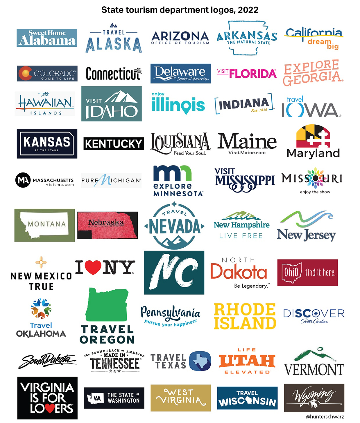
(from Hunter Schwarz)
Some are the same; some are better, some may be worse. Feel free to discuss them in the comments, because I’m fucking done.


Um, that’s not Ohio’s tourism logo. I wonder how many others are wrong.
Ah, I was skimming and didn’t catch that these are a decade old. The supposed 2022 image isn’t Ohio’s either, though.
A lot of Oklahoma, especially Tulsa, was built during the oil boom there at the height of Art Deco, so there’s quite a bit of it there.
If you’ve ever driven through Kansas, you’ll understand how the boring featureless logo is actually absolutely perfect.
South Dakota using Mount Rushmore makes sense. What else is there to see? Oil rigs surrounded by beat-up RVs?
I have no idea how the Colorado logo doesn’t have mountains on it.
A couple of missed jokes:
The Tennessee logo looks like a sausage brand logo.
The Maine logo – and tagline “It must be maine” – look and sound like they’re a 2000s sitcom.
The hands down undisputed king of state logos has to be I Love NY. Its so effective they haven’t had to touch it for 48 years, VA is probably just as classic. Some of them seem to be getting up there. Pure Michigan seems like its been around at least 20 years now, same with Texas. I can hear the southern drawl on the commercial saying “Texas, its like a whole other country.” Georgia’s seems to be at least 10 or more. Seeing a lot of California’s logo lately but it seems a mid 2010s creation, but they are getting it out there. Hawaii used to do that in the late 90s, would see that logo all over TV then. Some other may be just as old but their marketing budget hasn’t gotten them to my eyes quite as much as those. Been seeing more localized tourism spots being advertised lately like Newport RI, but they don’t appear to use the full RI tourism logo in the commercial
“Ohio the state of perfect balance.” The perfect balance of what? The amount of people willing to flee the planet just to get out of that god forsaken hell hole? Rivers of literal fire!
Our logo sux….But Wild and Wonderful WV since 1969 pretty cool. The “Open for Business” on the state signs was never the Tourism’s slogan.
Lol almost all of these are fodder for the “design is my passion” meme. The sad part is knowing how much states pay for these and still wind up with logos that look like Gladdis in accounting made them in Word over lunch.
Alabama’s logo only works if it’s printed on Frisbees.
A note on “Virginia is for Lovers” — adopted as a slogan in 1969, just two years after the Supreme Court struck down Virginia’s laws banning interracial relationships. The case was Loving v. Virginia, named for plaintiffs Mr. and Mrs. Loving. Coincidence?
The slogan should be “fine, Virginia is for [interracial] lovers, but only because the Supreme Court forced us.”
I still think Joe Mansion’s Open For Business is fitting for WV’s current political climate.
*but most of the people I meet wandering their mountains don’t deserve that slogan: they just makin they way best they can
I’m amazed how many states decided to say f** you to proper capitalization. Like the ones that do all-caps I can accept, but I’m amazed by all the states that do all lowercase and don’t even capitalize the first letter of the state name.
Speaking of which, as in the logo above and when it comes to license plates, apparently Virgina plates use “the only book-typography font style with bracketed (tapered) serifs seen on any Western country’s license plates. (All other license plate fonts are sans-serif — with only occasional slab-style serifs added on some letters to prevent confusion with similar characters).”
Also, the original “VA is for Lovers” sign seen when driving into the State is far superior to the weak version shown above.
https://131611568.cdn6.editmysite.com/uploads/1/3/1/6/131611568/s943568190212894916_p602_i1_w659.jpeg
Finally, shortly after birth all children born in Maryland must sign a document requiring them to respond to any attacks on any version of the State Flag, as here, with an energetic “Fuck you. Hon.”
North Carolina’s new logo reminds me of the time that Darryl’s (a now-defunct restaurant chain) inexplicably redecorated all of their restaurants in a country/faux Cajun theme, with sayings painted all over the place in crude white lettering.
And…dare I say it…Lesser Carolina’s new logo looks way better than North Carolina’s.
The old Ohio one was physically offensive. I really didn’t like that one. North Dakota’s script looks like it should be on an energy drink can. Rhode Island’s logo was cool, they shouldn’t have changed it. Mississippi was also very neat.
I dunno. Jalopnik level snark is beneath this site’s capabilities and talent level.
Ha, the new state tourism department logo with the “Made in Tennessee” slogan and attendant advertising graphics were actually made by an out-of-state advertising agency in Missouri in 2014. It was speculated that the governor at the time, Bill Haslam, had financial ties to the Missouri agency but thanks to a law that Haslam signed on his very first day as governor allowing Tennessee’s elected officials to refuse divulging their sources of income it was difficult to investigate (also noteworthy is how it enabled Haslam to refuse divulging the exact nature of his role in his family’s Pilot Flying J company when it was embroiled in a scandal involving a massive fraud scheme scamming truckers, most of who “just so happened” to be Hispanic or POC.) Good grief.
Tennessee also hired a Kentucky company for $400k or so to design a new official state ‘logo’ for general use. The result is basically the old rectangular GM logo (see, auto related:)) with TN instead of GM.
It was mostly controversial because 99.9% of the state goes, why not use the ‘tri-star’ logo that’s already used on everything, including the state flag??