
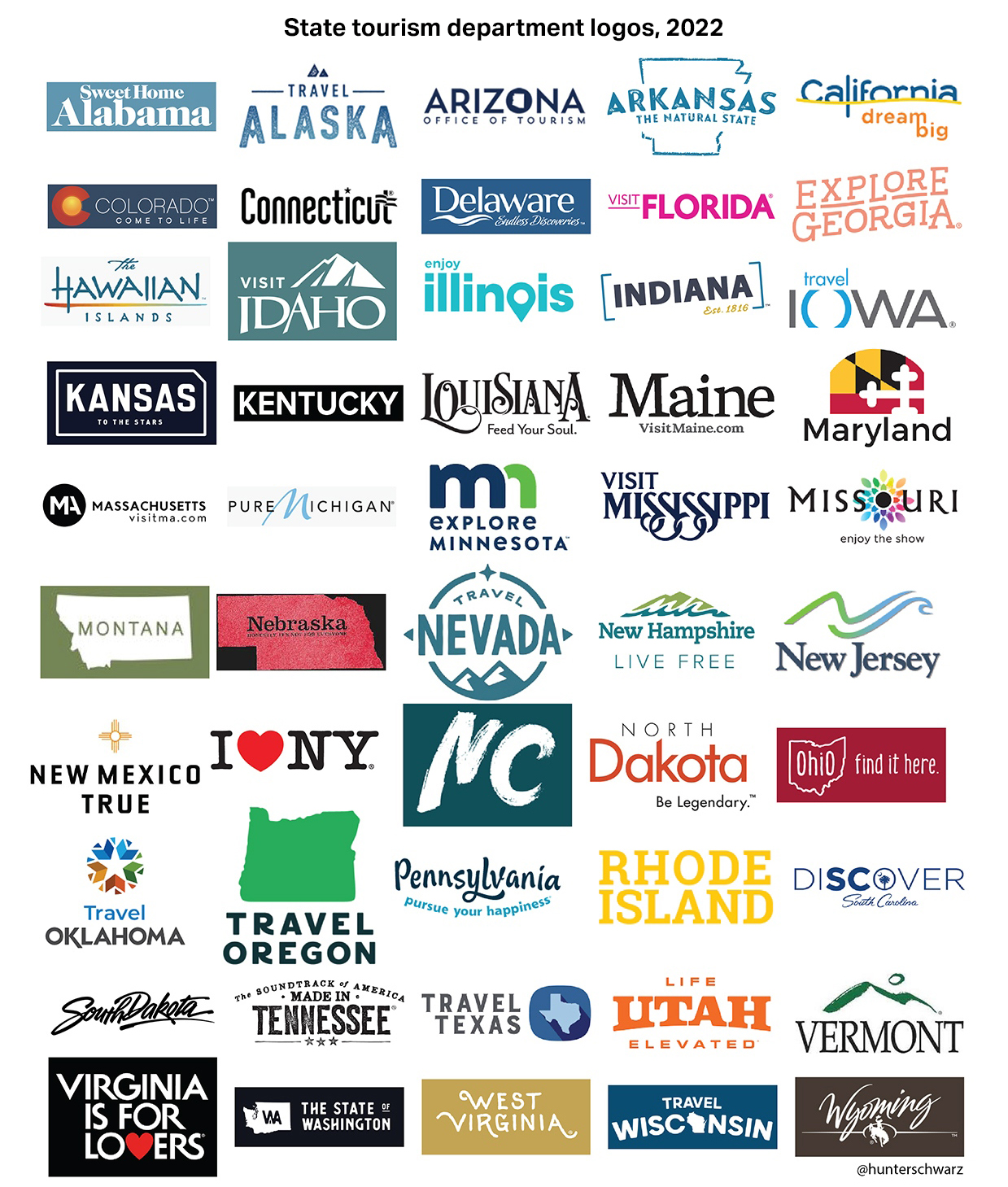
You know how every state has a special tourism-use logo? No? Well, they do. I suspect a lot of people who weren’t aware of this became aware of this because a tweet with all the state tourism logos recently went sort of viral, though, to be fair, this seems to happen every so often, as the same graphic seems to have gone viral in 2022. I guess the allure of state tourism logos is just that strong.
Anyway, this image of all these logos (which actually seem to be about a decade out of date; I’ll show an image with more current logos at the end of the article) captured our attention here, so we decided what the hell, let’s rank them! It’ll be fun, right? Right?
Before I started writing about cars full time, I was a designer, and I absolutely loved logo design. I still do, really. So there’s an inherent appeal to this for me, though when I agreed to write something about this, I don’t think I appreciated how big a number 50 can be.
Official state logos. What do you guys think. pic.twitter.com/gQrGHilr7f
— ettingermentum???????? (@ettingermentum) June 10, 2024
Still, I said I’d rank these, so that’s what I’m going to do, dammit. Here we go!
 50. West Virginia
This one is just terrible. It looks like it was made with whatever design software came on a Packard Bell in 1998 and represents at least 12 minutes of labor.

49. Kansas
This logo could be for almost anything. Well, anything boring. This feels like a local property management company’s logo, or maybe a firm that makes components for vacuum flasks. Plus, that motto, “as big as you think” is hardly something that would excite tourists. Oh boy, they’ll think, it’s what I thought it was, scale-wise!

48. Delaware
I guess the plus side of this one is that the script sort of feels like the badging of a ’70s Cadillac. Other than that, this tells you absolutely nothing about the state or why you should visit it, which feels pretty on-brand for Delaware, a state whose state bird is a notepad with the word “bird” scrawled on it. Matt says it looks like a signature, which is significant, since the only thing people do in Delaware is form LLCs.

47. Washington
Washington’s logo feels like the icon for some kind of shitty app that, I don’t know, tracks your bowel movements in relation to the current value of bitcoin or something like that. It even says BETA 1.0 on it? Why? The state better not be in beta still, they’ve had since 1889 to figure this out.

46. Connecticut
Okay okay, we get it, Connecticut has the word “connect” in it. Cool. By showing that, the logo also makes clear that the rest of the name spells out “I cut” which is a little sinister. I respect Helvetica and all that, but this feels pretty phoned-in.

45. Massachusetts
The only thing I like about this logo is how the ® symbol over the period looks a little like a question mark, making the tagline “It’s all here?” which feels much more appropriate.

44. North Dakota
This one and South Dakota feel like they worked together, or one copied off the other to come up with this cheesy, over-exuberant sort of half-script look. This has way too many live laugh love vibes.

43. South Dakota
Like I said, the typography just feels like a slightly more curvy and clean version of the North Dakota logo, but they threw in their big Mountain of Presidents’ Faces, which, sure, they should do that. What other state has Lincoln’s nostrils so big you can sleep in them?

42. New Hampshire
This looks like the box art of some really disappointing educational wooden toy village set, or something. The kind of thing guaranteed to ruin a kid’s birthday when some Montessori-addled aunt gives it as a gift.

41. Oklahoma
I’m all for Oklahoma pushing their Native American heritage, but how exactly did an Art Deco typeface end up on something about Native Americans? I don’t mind it, I just don’t get the connection.

40. South Carolina
Ah yes, Garbage Carolina! Crescent moon, that tree, and an extremely ’90s-looking typographic treatment. This feels like it hasn’t been thought about in 30 years. Good.

39. Arizona
It just feels like that 99¢ iced tea in the tall cans.

38. Virginia
Virginia has had this motto since 1969, and I have yet to see any evidence this is true. They don’t even like it when you try to love yourself in one of their rest stops!

37. Ilinois
What is this one? It just seems to be emphasizing how long it feels when you’re trying to drive out of the damn state.

36. Iowa
This one really baffles me. It has slight medical/rehab facility feelings, and there’s something about the word life in those kinds of italics, next to one of these things:|, that makes me want to puke a bit. You can pair this logo with those pictures of women laughing alone with salad.

35. Ohio
Okay, but this logo is not balanced! Why not have a similar-sized O on both sides? What am I missing here?

34. Nebraska
Ugh, this one is boring aigh eff. I guess I like how the – what is that, a piece of hay?– forms the crossbars of the As? But that motto “possibilities…endless” is deeply weird. Why the ellipsis? It sounds like the cryptic dying words of some scientist on the verge of a breakthrough, but then gets killed in a lab explosion or some shit.

33. Missouri
I get what they were going for here, but this feels like a t-shirt from some fraternity’s waterslide blowout.

32. Indiana
I’m all for the Indy 500 references like in that motto, but there’s nothing else remotely race-like about this. Are those skid marks? And that typeface looks like it should be the titles for some Star Wars rip-off movie.

31. Minnesota
This feels very Minnesota in that I expect it to have been made by someone’s sweet aunt who is about to apologize for it.

30. Vermont
This feels pretty dated, typographically, but I guess that gestural mountain isn’t bad, if your goal is to make a logo that’s able to be forgotten almost immediately.

29. Maryland
Maryland’s logo is a third-tier pizza chain. Maybe they have a special pizza with crab on it, or something.

28. Kentucky
Matt said this looks like an airline for horses, and he’s absolutely right.

27. Florida
Orange, I guess because oranges grow there, and everything else because no one really gave a shit.

26. Arkansas
Okay, the motto is sort of clever. And there’s a little leaf. How am I not even halfway done? Why did I agree to do this?

25. Colorado
I don’t even know what “let’s talk” means in this context. This looks like a logo that was agreed on when someone important glanced up from their phone and said “sure.”

24. New Mexico
I guess at least they’re trying something more bold here, with everything wood-burned into a partially-eaten graham cracker.

23. Tennessee
This one has a certain fun quality about it, and I think I just this second realized that shape on the “horizon” is supposed to evoke a guitar? I thought it was, like, a collapsed cow. And are those whiskers above the first E?

22. North Carolina
I suppose I admire North Carolina’s restraint here. I kind of like the typography, with those extended Ls and ts, but it’s maybe a bit too modest. Also, I admire how it conveys fuck-all about the state.

21. Alabama
I know what it’s supposed to be, but it looks like Sweet Alabama Home. Also, it feels like a minor league baseball team. Very minor.

20. New Jersey
This one only made it this high because I forgot about it. It looks like some early-2000s dialysis company.

19. Idaho
Idaho has to show you a map of where it is because they’re correctly assuming you forgot.

18. Lousiana
I kind of like the crude look of the typography? And they sure did a good job avoiding all the cliched things that people may actually know or give a damn about when it comes to Louisiana, so, congratulations, I guess?

17. Utah
I admire how the designer was just not going to let that U get away with not having bottom serifs. Not on their watch.

16. Texas
Oh, I get it! Like from pants! The jeans-pants! Like what cowboys would pack their testicles into!

15. Nevada
I like Nevada’s logo because it evokes all of the rare, old, limited-edition books and obscure folios that the state is best known for.

14. Wyoming
You know what? Wyoming’s logo works.

13. California
I guess that’s a clever tagline, but this logo absolutely feels like it’s for some kind of prescription drug, maybe for IBS or some skin thing, or maybe incontinence. Yeah, incontinence, because that explains the liquidly yellow line.

12. Maine
The gray color and simple, basic design really manage to capture the long-term-records-storage-rivaling excitement of Maine.

11. Pennsylvania
I kinda like the keystone and simple typography. Feels like the logo of a general contractor I trust.

10. Montana
If a player piano was a logo, this would be it.

9. Oregon
Good on Oregon for making one of the few vertically oriented logos. And, I guess by pushing trees, they’re playing it pretty safe. There are trees there.

8. Michigan
This one only gets this high because I’m so used to seeing it on the back of press cars I get.

7. Wisconsin
This one also kinda slipped in because I forgot about it earlier. Wisconsin, in white, sort of looks like a chef’s hat, doesn’t it?

6. Rhode Island
I like Rhode Island’s logo because it manages to evoke tattoos and scrimshaw and Moby Dick, which is pretty good for two words and a symbol.

5. New York
I mean, even for my jaded ass, this is a classic. Milton Glaser came up with it back in 1976, and it still gets the job done today.

4. Mississippi
Mississippi’s logo clearly has fun with the idiosyncratic name, and feels whimsical and a little evocative of times past, which, in Mississippi’s case, is kind of dangerous territory. Still, it’s fun.

3. Georgia
Maybe because I’ve gotten used to seeing this after all those movies and television shows shot in Atlanta, but I like the friendly typography and the stylized, colorful peach. In my head, this isn’t just a peach, it’s the “Big Butt” water tower shaped like a peach around Gaffney, South Carlina. That thing is called the Peachoid? I had no idea. Also, I thought it was in Georgia! I’ve got a lot of growing up to do.
 2. Hawaii
I think I just put this at number two because I’m desperate for color. Also, the rough characters seem to feel right for this.

1. Alaska
I like this one! I like how the As have become mountain peaks, I like the irregular baseline, it feels active and clever and still simple and clear. Good job!
Oy, that was a lot. And, as promised, here’s what the updated state tourism logos look like (as of 2022), courtesy of journalist Hunter Schwartz, who seems to have been the first person to notice this.:
(from Hunter Schwarz)
Some are the same; some are better, some may be worse. Feel free to discuss them in the comments, because I’m fucking done.


What I’ve learned is there is not a single decent graphic designer in any of these states.
My take was that in each state there is at least one mediocre graphic designer related to a senator/congressman/governor/etc.
At least not one willing to design these logos. Which makes sense, because they almost assuredly weren’t willing to pay enough. I suspect a lot of these projects were pushed to their media person who tried hard, but is much more of a communications person than a designer. And some of them were probably some contest that offered no reward beyond your logo being used (uncredited).
Keep in mind that they would have been chosen by “lowest and best bid”. You get what you pay for.
And selected by a committee composed of people with no particular expertise in the field and a mandate to chose whatever is guaranteed to not offend anyone
Your tax dollars at work. Well, not yours, but you know what I mean.
If you think that’s bad, you should see our license plates in Ohio. They were designed by the governor’s wife. In addition to being god-awful ugly, they originally had the Wright Flyer backwards. It’s since been corrected, but not before a few thousand plates were printed.
There’s no such thing as a decent graphic designer because graphic design is 100% subjective and thus is a field dominated by scam artists.
Note: I’m writing this immediately after presenting a logo to a team of people that have no success criteria in mind other than how “it makes them feel”, and I’m about to become a serial killer.
I have massive respect for Kentucky’s tourism motto. Somehow in two words they managed to talk about horses (Kentucky Derby/horse country around Lexington), the Bourbon Trail, and a sense of wilderness.
Saw a bumper sticker here a few years ago:
TEXAS It’s like a whole other third world country…
The updated version:
TEXAS It’s like a whole other dystopia…
I’ve always wondered why Colorado’s tourism office doesn’t just use the “Welcome to Colorful Colorado” sign for its logo.
Living in Colorado for eight years, I thought the same, too.
At least, the state didn’t dare using the horrendous “nuclear winter” signage from the 1990s again.
Yeah, those signs were short-lived. Best not mess with something iconic that’s been used since the ’50s.
Bravo, I for one applaud the effort and got a few good chuckles off it.
Kudos to the tourism board of Massachusetts who, as practical people, remind everyone that all of Massachusetts is within Massachusetts.
The alternative was “The State You Cannot Spell Right”
I only know how to spell Mississippi from a 1950s cartoon
Oh, gosh. I remember the IMSA car that had something like “LOVE FL” on it from being sponsored by Florida’s tourism board. Problem is, a few friends and I had talked about this one guy’s fleshlight so much that it had an abbreviation: FL.
I’m sure they do love those in Florida. I’m absolutely sure they do.
So, yeah: I can’t get THAT association out of my brain.
Also, Pure Michigan ranks way, way too high for a motto that’s become so, so memeable. So much rust you can see the road underneath you? Pure Michigan, baby!
Mississippi’s curly Ses make it an S-tier logo. Hands down one of the best.
Also, I’m a sucker for butt emojis, so I’m glad to see Georgia’s butt near the top, too. Georgia: THE THICC STATE.
I enjoyed this. Thanks Jason
I am so here for Jason’s unbridled roasts of design elements. What’s next in this series? Washing machine brand logos? This is becoming a regular series, right?
Yes! Bring on the logos!
If not washing machines, at least go through the logos of common and obscure car manufacturers.
I went to my state first and then was confused because I didn’t recognize the logo at all… then realized I don’t see the logo much because they don’t advertise traveling to a place when you are already there.
I need sleep.
I actually love South Dakota and it’s logo; also New Hampshire, New Mexico, Wyoming, Montana, New York(classic!), Hawaii and Alaska…really surprised about the WA state one- it could have been amazing. Virginia is for lovers is hilarious especially since it’s been that logo since 69…also, they “love” to give you speeding tickets…it would be better if they promoted the Chevy LUV in the logo!
Forgottonia (occasionally separatist portion of Illinois). Slogan – It’s a nice place to live but you wouldn’t want to visit there.
I was born there! Not an exciting place, but that slogan feels pretty fitting!
New state slogans:
States
50. West Virginia
We dig coal
49. Kansas
Nothing to see here folks
48. Delaware
Smell the DuPont!
47. Washington
Canada with volcanos
46. Connecticut
How’s your insurance plan?
45. Massachusetts
Pahk ya cah heeya
44. North Dakota
Frakkin’ Awesome!
43. South Dakota
Black hills, black hearts
42. New Hampshire
We’re quaint!
41. Oklahoma
100 years without a race massacre
40. South Carolina
Garbage in, garbage out
39. Arizona
Are you using that river?
38. Virginia
Virginia is for Rebel lovers
37. Illinois
Da Bears
36. Iowa
Caitlin Clarke slept here
35. Ohio
Sorry ‘bout Jim Jordan, America
34. Nebraska
Lights out at 8 pm people!
33. Missouri
Missouri loves company
32. Indiana
Restart your engines with ethanol
31. Minnesota
I can’t breathe!
30. Vermont
Nearly as many crazy militias as Idaho
29. Maryland
We’ve got crabs!
28. Kentucky
Horse racing and, um, oh yeah Daniel Boone
27. Florida
Come for Disney; stay for the corruption
26. Arkansas
Corruption? Hold my beer
25. Colorado
What, are you high?
24. New Mexico
Santa Fe. Flagstaff. Nothing else.
23. Tennessee
Taylor Swift used to sleep here
22. North Carolina
We couldn’t think of anything to say
21. Alabama
Welcome to MAGA Land
20. New Jersey
First in flight delays
19. Idaho
Come for the potatoes; stay for the insurrection
18. Louisiana
Why you laughin’, you?
17. Utah
Sisters, wives what’s the difference?
16. Texas
Even our assholes are bigger
15. Nevada
Nothing here is real except the syphilis
14. Wyoming
The Big Empty
13. California
Proof that you can fuck up a good thing
12. Maine
We used to be Vacationland
11. Pennsylvania
We were crude before Texas
10. Montana
Say hello to my little friend
9. Oregon
Half our state wants to secede
8. Michigan
You want office space? We got it!
7. Wisconsin
Legend Dairy. See what we did there?
6. Rhode Island
Not an actual island
5. New York
New York 3, Trump 0
4. Mississippi
The poor man’s Alabama
3. Georgia
Peaches and screams
2. Hawai’i
Aloha also means goodbye. Take a hint.
1. Alaska
Good place to hide from US Marshals
Flagstaff is in Arizona. But maybe that’s the joke.
Wasn’t sure anyone would get it. My mother always confuses cities in New Mexico, Arizona, and Nevada like it’s all on place.
It used to be all one place.
Florida: You better not say you’re gay!
Nebraska: what lights?
Brilliant!
Missouri loves company should actually be their motto.
Da Bears are going to beat da packers 55-2.
Aren’t Vermont and New Hampshire backwards? I thought NH was the one that attracted militias.
I’ve heard “Ya can’t get thea from heaya” for Maine.
South Dakota and South Carolina should have a cage match over who gets to use the faces-places thing.
Kansas’ motto should be, “Not TOTALLY flat.”
Where did you find these?
The I❤️NY is the only one I have ever seen.
I’ve lived in California off and on for at least half my life, I guess 35 years including the first 20 and I’m pretty sure that the California state slogan is “Spend money, go the fuck home, and don’t even think of moving here.”
Much like “ Live free or die, we don’t care” in New Hampshire.
I kind of like the Kansas slogan, presumably “Actual Size” was already claimed by They Might Be Giants.
There used to be bumper stickers in New Hampshire that said, “Welcome to New Hampshire, now go home.” We love the tourist money; just don’t move here.
Indiana looks like a logo for an electric utility, Maine’s could be the title card for a teen sitcom, and Rhode Island’s looks like a beer label.
I’m pretty sure this is the official Maryland logo
https://localvyntage.com/cdn/shop/products/maryland-is-for-crabs-t-shirt-front-royal-blue_1080x1080.jpg?v=1608233797
Also available on underwear
Thankfully Nebraska ditched the “Honestly it’s not for everyone” passive aggressive bullshit Minnesota is all about.
Also this post is written like someone pissed in Torch’s Krusty Os this morning lol
Here are a few options I feel better define each state now for vehicular tourism:
Minnesota: We were here first, but go ahead and pass us in the right lane.
Nebraska: Yes, that is a steer riding shotgun.
North Dakota: Yes, that is a shotgun in the rear window.
North Carolina: No squatters allowed.
Illinois: We greet you with flashing brights, horns, and middle fingers.
South Dakota: Harley’s, welcome. Trucks towing Harley’s to Sturgis, also welcome!
Pennsylvania: We Brake for Buggies
Indiana: Pace It Yourself
Kansas: We made cruise control a thing.
This is what happens when you’re “on the juice”!
Vermont’s is exactly what it says on the tin: it’s a green mountain.
For North and South Dakota, it feels like they chose red and black for the text because they wanted to make people think of a checkers game.
Oklahoma is all Art Deco-ey because we have a lot of Art Deco architecture here in northeast Oklahoma.
And the slogan is better than Oklahoma is OK, which was only our slogan because most Okies can’t spell mediocre.
What, no honorable mention for Washington DC?
Its “bitch set me up” combined with all the stylized dollar signs and stars is quite evocative.
You cannot convince me that North Dakota is real. Their logo is just a reworked title from “Dances with Wolves”
/if I fly on an airline for horses, do I get all the legroom a horse gets?
Oregon somehow managed to phone it in even harder the second time around, which is kinda impressive. Montana definitely got a downgrade as well. I’m glad Colorado finally realized they have a really clean and iconic flag design and leaned into that.
“Oregon somehow managed to phone it in even harder the second time around, which is kinda impressive.”
Well, we kinda blew our wad on making Miyazaki themed ads instead:
https://youtu.be/doVV1a7XgyQ?feature=shared
https://youtu.be/KIC-XmyEfhI?feature=shared
https://youtu.be/qi4fGPPPmGA?feature=shared
https://youtu.be/doVV1a7XgyQ?feature=shared
It sucked us so dry creatively that things have never been quite the same:
https://youtu.be/QGe2axnQpzM?feature=shared
The whiskers in the Tennessee logo are tuning pegs for the guitar.
I was starting to get worried that I hadn’t seen this mentioned
As a FYI, the Peachoid is in Gaffney, South Carolina, not Georgia.
Because ironically, despite Georgia being all about peaches… both CA and SC produce more peaches every year than GA.
It’s like making your entire identity about being third best at something, kind of odd.
Apparently, Jason has some sort of hang-up about “Garbage” South Carolina and never misses an opportunity to throw shade. Probably jealousy. We build BMWs and Jets. They grow hogs and tobacco.
I’m just teasing! Carolina sibling rivalry and all that. And don’t knock hos and tobacco, they’ve been keeping this nation going for longer than BMWs and jets combined.
I love how the edit of hogs and tobacco will forever be hoes and tobacco in your reply. Because honestly, the pre-edit is funnier as someone who lives literally at the NC/SC border.
They definitely have been helping to keep the country warmer than the hogs have.
For a while there they weren’t even third best: for a couple of years #3 was…New Jersey.
You misspelled Massachusetts. Can’t say I blame you.