
You know how every state has a special tourism-use logo? No? Well, they do. I suspect a lot of people who weren’t aware of this became aware of this because a tweet with all the state tourism logos recently went sort of viral, though, to be fair, this seems to happen every so often, as the same graphic seems to have gone viral in 2022. I guess the allure of state tourism logos is just that strong.
Anyway, this image of all these logos (which actually seem to be about a decade out of date; I’ll show an image with more current logos at the end of the article) captured our attention here, so we decided what the hell, let’s rank them! It’ll be fun, right? Right?
Before I started writing about cars full time, I was a designer, and I absolutely loved logo design. I still do, really. So there’s an inherent appeal to this for me, though when I agreed to write something about this, I don’t think I appreciated how big a number 50 can be.
Official state logos. What do you guys think. pic.twitter.com/gQrGHilr7f
— ettingermentum???????? (@ettingermentum) June 10, 2024
Still, I said I’d rank these, so that’s what I’m going to do, dammit. Here we go!
 50. West Virginia
This one is just terrible. It looks like it was made with whatever design software came on a Packard Bell in 1998 and represents at least 12 minutes of labor.

49. Kansas
This logo could be for almost anything. Well, anything boring. This feels like a local property management company’s logo, or maybe a firm that makes components for vacuum flasks. Plus, that motto, “as big as you think” is hardly something that would excite tourists. Oh boy, they’ll think, it’s what I thought it was, scale-wise!

48. Delaware
I guess the plus side of this one is that the script sort of feels like the badging of a ’70s Cadillac. Other than that, this tells you absolutely nothing about the state or why you should visit it, which feels pretty on-brand for Delaware, a state whose state bird is a notepad with the word “bird” scrawled on it. Matt says it looks like a signature, which is significant, since the only thing people do in Delaware is form LLCs.

47. Washington
Washington’s logo feels like the icon for some kind of shitty app that, I don’t know, tracks your bowel movements in relation to the current value of bitcoin or something like that. It even says BETA 1.0 on it? Why? The state better not be in beta still, they’ve had since 1889 to figure this out.

46. Connecticut
Okay okay, we get it, Connecticut has the word “connect” in it. Cool. By showing that, the logo also makes clear that the rest of the name spells out “I cut” which is a little sinister. I respect Helvetica and all that, but this feels pretty phoned-in.

45. Massachusetts
The only thing I like about this logo is how the ® symbol over the period looks a little like a question mark, making the tagline “It’s all here?” which feels much more appropriate.

44. North Dakota
This one and South Dakota feel like they worked together, or one copied off the other to come up with this cheesy, over-exuberant sort of half-script look. This has way too many live laugh love vibes.

43. South Dakota
Like I said, the typography just feels like a slightly more curvy and clean version of the North Dakota logo, but they threw in their big Mountain of Presidents’ Faces, which, sure, they should do that. What other state has Lincoln’s nostrils so big you can sleep in them?

42. New Hampshire
This looks like the box art of some really disappointing educational wooden toy village set, or something. The kind of thing guaranteed to ruin a kid’s birthday when some Montessori-addled aunt gives it as a gift.

41. Oklahoma
I’m all for Oklahoma pushing their Native American heritage, but how exactly did an Art Deco typeface end up on something about Native Americans? I don’t mind it, I just don’t get the connection.

40. South Carolina
Ah yes, Garbage Carolina! Crescent moon, that tree, and an extremely ’90s-looking typographic treatment. This feels like it hasn’t been thought about in 30 years. Good.

39. Arizona
It just feels like that 99¢ iced tea in the tall cans.

38. Virginia
Virginia has had this motto since 1969, and I have yet to see any evidence this is true. They don’t even like it when you try to love yourself in one of their rest stops!

37. Ilinois
What is this one? It just seems to be emphasizing how long it feels when you’re trying to drive out of the damn state.

36. Iowa
This one really baffles me. It has slight medical/rehab facility feelings, and there’s something about the word life in those kinds of italics, next to one of these things:|, that makes me want to puke a bit. You can pair this logo with those pictures of women laughing alone with salad.

35. Ohio
Okay, but this logo is not balanced! Why not have a similar-sized O on both sides? What am I missing here?

34. Nebraska
Ugh, this one is boring aigh eff. I guess I like how the – what is that, a piece of hay?– forms the crossbars of the As? But that motto “possibilities…endless” is deeply weird. Why the ellipsis? It sounds like the cryptic dying words of some scientist on the verge of a breakthrough, but then gets killed in a lab explosion or some shit.

33. Missouri
I get what they were going for here, but this feels like a t-shirt from some fraternity’s waterslide blowout.

32. Indiana
I’m all for the Indy 500 references like in that motto, but there’s nothing else remotely race-like about this. Are those skid marks? And that typeface looks like it should be the titles for some Star Wars rip-off movie.

31. Minnesota
This feels very Minnesota in that I expect it to have been made by someone’s sweet aunt who is about to apologize for it.

30. Vermont
This feels pretty dated, typographically, but I guess that gestural mountain isn’t bad, if your goal is to make a logo that’s able to be forgotten almost immediately.

29. Maryland
Maryland’s logo is a third-tier pizza chain. Maybe they have a special pizza with crab on it, or something.

28. Kentucky
Matt said this looks like an airline for horses, and he’s absolutely right.

27. Florida
Orange, I guess because oranges grow there, and everything else because no one really gave a shit.

26. Arkansas
Okay, the motto is sort of clever. And there’s a little leaf. How am I not even halfway done? Why did I agree to do this?

25. Colorado
I don’t even know what “let’s talk” means in this context. This looks like a logo that was agreed on when someone important glanced up from their phone and said “sure.”

24. New Mexico
I guess at least they’re trying something more bold here, with everything wood-burned into a partially-eaten graham cracker.

23. Tennessee
This one has a certain fun quality about it, and I think I just this second realized that shape on the “horizon” is supposed to evoke a guitar? I thought it was, like, a collapsed cow. And are those whiskers above the first E?

22. North Carolina
I suppose I admire North Carolina’s restraint here. I kind of like the typography, with those extended Ls and ts, but it’s maybe a bit too modest. Also, I admire how it conveys fuck-all about the state.

21. Alabama
I know what it’s supposed to be, but it looks like Sweet Alabama Home. Also, it feels like a minor league baseball team. Very minor.

20. New Jersey
This one only made it this high because I forgot about it. It looks like some early-2000s dialysis company.

19. Idaho
Idaho has to show you a map of where it is because they’re correctly assuming you forgot.

18. Lousiana
I kind of like the crude look of the typography? And they sure did a good job avoiding all the cliched things that people may actually know or give a damn about when it comes to Louisiana, so, congratulations, I guess?

17. Utah
I admire how the designer was just not going to let that U get away with not having bottom serifs. Not on their watch.

16. Texas
Oh, I get it! Like from pants! The jeans-pants! Like what cowboys would pack their testicles into!

15. Nevada
I like Nevada’s logo because it evokes all of the rare, old, limited-edition books and obscure folios that the state is best known for.

14. Wyoming
You know what? Wyoming’s logo works.

13. California
I guess that’s a clever tagline, but this logo absolutely feels like it’s for some kind of prescription drug, maybe for IBS or some skin thing, or maybe incontinence. Yeah, incontinence, because that explains the liquidly yellow line.

12. Maine
The gray color and simple, basic design really manage to capture the long-term-records-storage-rivaling excitement of Maine.

11. Pennsylvania
I kinda like the keystone and simple typography. Feels like the logo of a general contractor I trust.

10. Montana
If a player piano was a logo, this would be it.

9. Oregon
Good on Oregon for making one of the few vertically oriented logos. And, I guess by pushing trees, they’re playing it pretty safe. There are trees there.

8. Michigan
This one only gets this high because I’m so used to seeing it on the back of press cars I get.

7. Wisconsin
This one also kinda slipped in because I forgot about it earlier. Wisconsin, in white, sort of looks like a chef’s hat, doesn’t it?

6. Rhode Island
I like Rhode Island’s logo because it manages to evoke tattoos and scrimshaw and Moby Dick, which is pretty good for two words and a symbol.

5. New York
I mean, even for my jaded ass, this is a classic. Milton Glaser came up with it back in 1976, and it still gets the job done today.

4. Mississippi
Mississippi’s logo clearly has fun with the idiosyncratic name, and feels whimsical and a little evocative of times past, which, in Mississippi’s case, is kind of dangerous territory. Still, it’s fun.

3. Georgia
Maybe because I’ve gotten used to seeing this after all those movies and television shows shot in Atlanta, but I like the friendly typography and the stylized, colorful peach. In my head, this isn’t just a peach, it’s the “Big Butt” water tower shaped like a peach around Gaffney, South Carlina. That thing is called the Peachoid? I had no idea. Also, I thought it was in Georgia! I’ve got a lot of growing up to do.
 2. Hawaii
I think I just put this at number two because I’m desperate for color. Also, the rough characters seem to feel right for this.

1. Alaska
I like this one! I like how the As have become mountain peaks, I like the irregular baseline, it feels active and clever and still simple and clear. Good job!
Oy, that was a lot. And, as promised, here’s what the updated state tourism logos look like (as of 2022), courtesy of journalist Hunter Schwartz, who seems to have been the first person to notice this.:
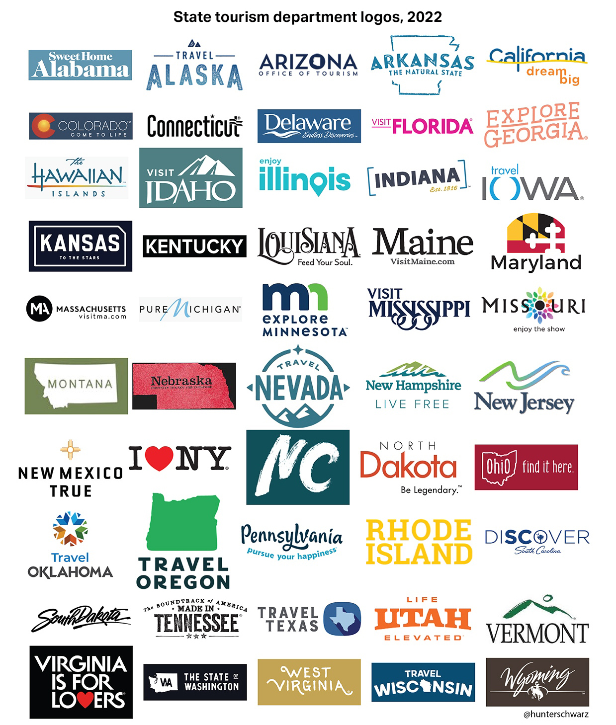
(from Hunter Schwarz)
Some are the same; some are better, some may be worse. Feel free to discuss them in the comments, because I’m fucking done.


I particularly like California’s logo, which is absolutely reminding you that it will sink into the ocean one day in the future after the San Andreas fault gives way.
Jason do state line welcome signs next!
I second this! We always laughed driving through Indiana because the signs said, “The Crossroads of America.” Just outright admitting that we are all just passing through on our way to better places.
old-school, pre-herb Deadspin vibes, thank you!
Car related: That weird ass shape at the end of the old PA logo is also used in their state route signs
It’s a keystone, the central stone at the top of an arch that keeps the whole thing from collapsing. I guess because PA was considered that during the revolution?
I kinda liked our previous state motto of “Nebraska: It’s not for Everyone”. Both exclusive, weird, and a bit of a warning to foreigners.
Before that it was “The Good Life” for years, it was even on our license plates for a while. Because nobody visits Nebraska, you are born here, and labored until you died here.
LOL, I don’t know why, but a slogan that sounds like a threat makes me giggle. 🙂
Some of us made it out 🙂
I can leave whenever I want! (after I sell my house and find a place with equivalent pay and cost of living) (Oh, and everybody I know is dead)
I really like Montana’s tourism slogan, “Get Lost.” Really captures the ethos of the place.
North Carolina to me says “You know who I am”. Also proving why we are the Best Carolina.
If West Virginia’s logo took 12 minutes, I bet North Carolina’s took 12 seconds. Open notepad, type state name (making sure not to capitalize the proper noun), click save. Done. NC should be #50 for the complete and utter lack of effort.
Come on now. If you’re going to have a non-monospace font you have to at least be using WordPad!
Wow, the “U” in “Utah” is an actual crime of typography. Straight to designer jail!
Based on your editorials, it looks like Wyoming was severely short-changed in the ranking.
I’ve lived in Ohio most of my life and “State of Perfect Balance” has never been used as a tourism logo. No idea where you found that one.
There’s been “Find It Here”, “So Much To Discover” and the current (and past) slogan is “Ohio: The Heart of it All”. People seem to like that one.
https://ohio.org/travel-inspiration/articles/brand-anthem-ohio-the-heart-of-it-all
Grew up in Ohio, always liked “Birthplace of Aviation”.
Too bad you missed out on First in Flight.
Them’s fightin’ words, buddy. 🙂
The unending debate!
Don’t forget the time they went with- Ohio is for Lovers
When was that? That’s Virginia’s thing.
It’s a reference to Dayton, Ohio’s greatest cultural export since Wright Brothers, and acclaimed foundational emo band Hawthorne Heights.
Oh. I live in Dayton and I’ve never heard of them. Guess I’m an old, or I just hate emo. Probably both.
LOL Got me for a second there. I always thought it was tongue in cheek reference to Virginia, which it actually is, but you got me thinking wow, they named their song after an actual state logo?
Not so much lately. Now, every little hamlet and unincorporated locality has L O V E spelled out in different, creative sculptures. Some of them I had to go by a couple times before I realized that’s what they were going for
Huh. Haven’t noticed that, either. Guess I haven’t been outside of my little hamlet for a while…
Around the PHL area here there is a rental management company that puts a little RENT statue out front of their buildings in the same style with the stacked letters like LOVE statue at Love Park in PHL. I’ve seen it at a few rental developments
Shouldn’t it be Ohio: Round on the End. Hi in the Middle?
I like how “Texas: It’s like a whole other country” has morphed from a tourist slogan to a mantra for the ultra-right secessionists.
The same thing happened to ‘Don’t mess with Texas.’ What is now treated as some kind of jingoistic mantra dating back centuries was really an anti-littering slogan in the late 1980s.
I graduated from U. of Texas in the late 80’s, so I saw a lot of burnt orange t-shirts with the slogan and the Bevo logo.
Funny thing is that the “Don’t Mess With Texas” anti-littering campaign was the most successful of its kind in the US.
I can’t forget the lessons of Pee-Wee’s Big Adventure:
“The stars at night, are big and bright!”
*clapclapclapclap*
“You’re in the heart of Texas!”
1: In defense of Oklahoma, Tulsa has beautiful Art Deco architecture thanks to having gotten wealthy from oil production in that era.
2: I have no idea why Colorado runs away from the best logo..”Colorful Colorado” against the mountain backdrop.
Newer ones are definitely an improvement overall, but Alaska should have kept the mountains and Georgia should have kept the peach
Wow, NC’s got much worse. We have fantastic beaches and mountains and they can’t manage to work that into a logo
I guess “Florida: Free-Fire Zones and Humidity, Just Like In ‘Nam!” wasn’t short enough and “Florida: All Nuts Roll Downhill” was a bit too accurate.
(I can talk all this shit because I’m the only person who didn’t move here.)
So guess you’re not a ‘semi-native’ then? Guess that means ones been retired in FL for quite awhile??
Snowbird is the term you’re looking for. Retirees who winter down here.
I think you’re being a little tough on the lack of color. Most of the time, these logos will be used by non-profit and government agencies on a black-and-white page from the cheap DMV manual to some kids’ state fair flyer. Job #1 has to be readability.
What type of hack site is this, not making this a 50-page slide show with 25 auto-playing video ads in between the states? Are you trying to respect the readers or something here?!
Boo them!
Ohio, the state of perfect balance? I don’t remember them ever using that and I’ve lived here most of my life. Not effective, move it to last place.
Travel Oregon – first thing to come to mine was “You died of dysentery.” I’ll pass on Oregon.
Ohio’s actual tourism slogan is “The Heart of it All”. Again.
Yup. I prefer the “Birthplace of Aviation” but I guess that’s reserved for license plates. Or are we even using that anymore?
I don’t think that was ever technically the official tourism slogan, but it’s still used on license plates. The Ohio Tourist Board decides what the slogan will be, and that goes on all the marketing materials, highway welcome signs, website, yadda yadda. Ohio BMV decides what goes on the license plates, and they hadn’t strayed from “Birthplace” since forever.
Having driven down to Florida from both Illinois and Indiana (Chicagoland) yeah fuck that drive it takes like 6 hours just to get to Kentucky. So I agree Illinois motto is just how long it takes to drive from North to south in the state where you get to see all the wonderful corn fields and cows.
Hey! Don’t forget the soybean fields!
That’s very generous. The fact that the lines mean nothing and it’s all grey made me think bottom 5. And I’m from Indiana!
Same live in Indiana loved when the signs going in the state were the crossroads of America because yeah think most people are just driving through/flying over here hah. And yeah this tourism logo is turrible
I’m old enough to remember Wander Indiana (and the jingle).
Wait, I thought South Dakota’s new logo read “South Dakota We’re On It”. Maybe something’s mething with my head…
That sounds like South Dakota’s response to someone giving them a list of things they need to change about the state.
That was South Dakota’s short-livid, but long remembered anti-drug/unintended tourism campaign. “Meth. We’re on it.”.
Correct. Fascinating story behind it. Gov. Noem (yes, she of recent dog shooting fame) had the campaign drawn up by an out of state marketing firm (from Minneapolis, I believe) and it was not well received by the SD Department of Health. They (and others) in state government strongly recommended against it, but Noem overruled everybody and it got rolled out anyway. Social media had a field day with it, and the in-state marketing companies were collective pissed they all lost out on an $800,000 ad campaign, paid for with South Dakotans’ tax dollars.
Good times, if you got to watch it all from the peanut gallery.
Wait, you’re done before skewering the current logos? What’s that about???
I want more.
Overall it seems like the new logos are less awful overall as a group, though some states moved on from superior designs to blander ones.
I lived in Colorado for eight years so I have wondered about something…
“Welcome to Colorful Colorado” and “Nothing like Colorado” have been iconic state slogan for many decades. But why “Let’s Talk” and “Come to Life”? What sort of issues that Colorado has that we need to talk about? Has Colorado been languish or dead for a long time then “come to life” again?
I remember driving from Texas to Colorado on my first-ever American road trip in 1992, and I was aghast to see the then-new welcome sign at Colorado-New Mexico border. The signage resembled the nuclear winter and was taken down a few years later due to the intense public backlash.
I lived in Texas for twenty-plus years and thought “Don’t Mess with Texas” was apt description of Texas and its strong disdain for anything with the federal government and policies.
What I’ve learned is there is not a single decent graphic designer in any of these states.
My take was that in each state there is at least one mediocre graphic designer related to a senator/congressman/governor/etc.
At least not one willing to design these logos. Which makes sense, because they almost assuredly weren’t willing to pay enough. I suspect a lot of these projects were pushed to their media person who tried hard, but is much more of a communications person than a designer. And some of them were probably some contest that offered no reward beyond your logo being used (uncredited).
Keep in mind that they would have been chosen by “lowest and best bid”. You get what you pay for.
And selected by a committee composed of people with no particular expertise in the field and a mandate to chose whatever is guaranteed to not offend anyone
Your tax dollars at work. Well, not yours, but you know what I mean.
If you think that’s bad, you should see our license plates in Ohio. They were designed by the governor’s wife. In addition to being god-awful ugly, they originally had the Wright Flyer backwards. It’s since been corrected, but not before a few thousand plates were printed.
There’s no such thing as a decent graphic designer because graphic design is 100% subjective and thus is a field dominated by scam artists.
Note: I’m writing this immediately after presenting a logo to a team of people that have no success criteria in mind other than how “it makes them feel”, and I’m about to become a serial killer.