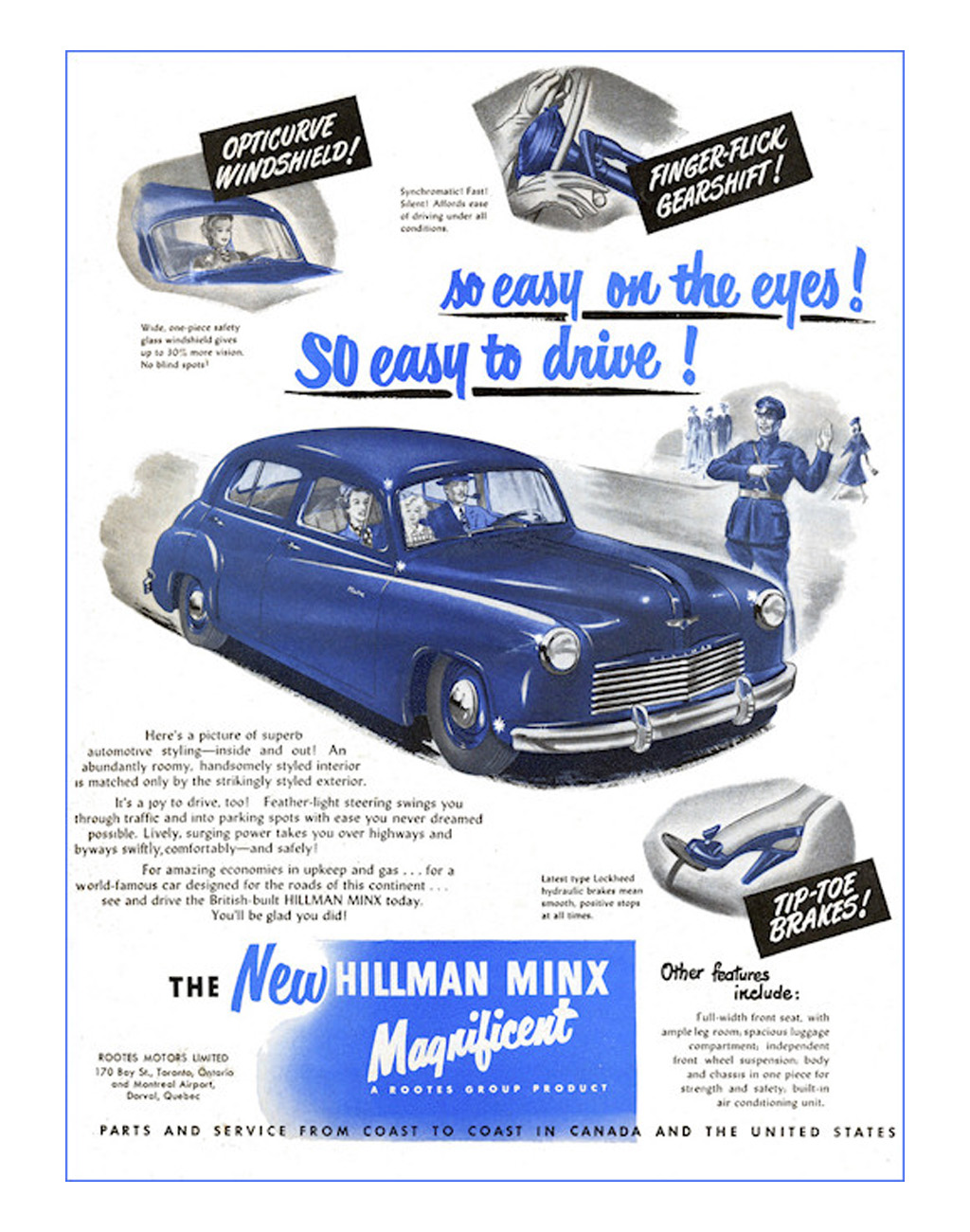
I feel like I’ve talked a lot about typography this week but it’s an important thing, and if you don’t believe me, then just look up there at that old 1949 Hillman Minx ad. Sure, a light-touch gearshift is a great thing! If it works with the mere action of a fingertip, that’s fantastic, so why not tout it? Why not come up with an alliterative name that conveys the very idea of this easy finger-actuation! With word that implies a cavalier, easy finger motion – flick! Finger-Flick! It’s perfect, right? Well, maybe. Until you write it in all caps, in which case I think even the Pope himself is just going to read that as FINGER FUCK and giggle, into his vestments.
Here’s the full page:

That Opticurve windshield sounds kinda hot, too.
The Minx was a funny dowdy little car; this look was new for 1949 and was fairly up-to-date with enclosed-fender pontoon styling – in fact, it’s a Raymond Loewy design! These were popular little economy cars, and made all of 37 hp from their 1265cc engines, so I don’t think you’d have trouble seeing one because of them whizzing by too fast.
But did no one look at this ad from, like five feet away? Did these places not routinely pull in like a dozen 13 year-old boys to review things and see what made them giggle? Is that not a common practice in the industry? It should be.
Because if there’s a human alive who doesn’t look at this ad and stifle a giggle at Finger-Fuck Gearshift, I haven’t met them. And maybe I don’t want to.


Less humorous but more ironic:
There’s a non-denominational church in my neighborhood called The Dwelling Place. Thanks to the overly flowy cursive font on the sign out front, it reads as “The Duelling Place.”
Seems convenient, you can go to church and demand satisfaction all at once
F i r s t burn c o p s , n o w t h i s .
A n y t h i n g t o g e t clicks e h ?
I once owned was a Bic lighter that genuinely looked like it said “fuck my dic” in crazy neon psychedelia
This is much funnier than booty.
Whenever I see the “NETFLIX” logo I always think “NETFUX”.
I’ve also seen the “MEGAFLICKS” store image.
I am firmly against sans serif fonts and Georgia is set as my default in my Office software. Apparently it’s specifically designed for easy readability.
Long live serifs!
Took a large drink of water, scrolled down, water everywhere… Thanks for outburst laugh.
Serious question. Did women really drive in heals like that?
Hell yes they do. It’s what I tell people when they say driving a manual is “too hard.” My wife can do it in 4 inch heels; you have no excuse.
Hey, if Ron DeSantis can do it…